You are viewing the Graphic Design Festival Scotland 2017 archive. Click Here for the Current Festival.
Graphic Design Festival Scotland, 20-26 October, 2017
GDFS, 20-26 Oct, 2017
GDFS
News > Article
International Poster Competition Winners!
29/10/2016
Our 2016 International Poster Competition ran from June to August this year and received 3443 entries from more than 70 countries. The competition was judged by Unfun, Lamm & Kirch, Warriors Studio and Étienne Hervy.
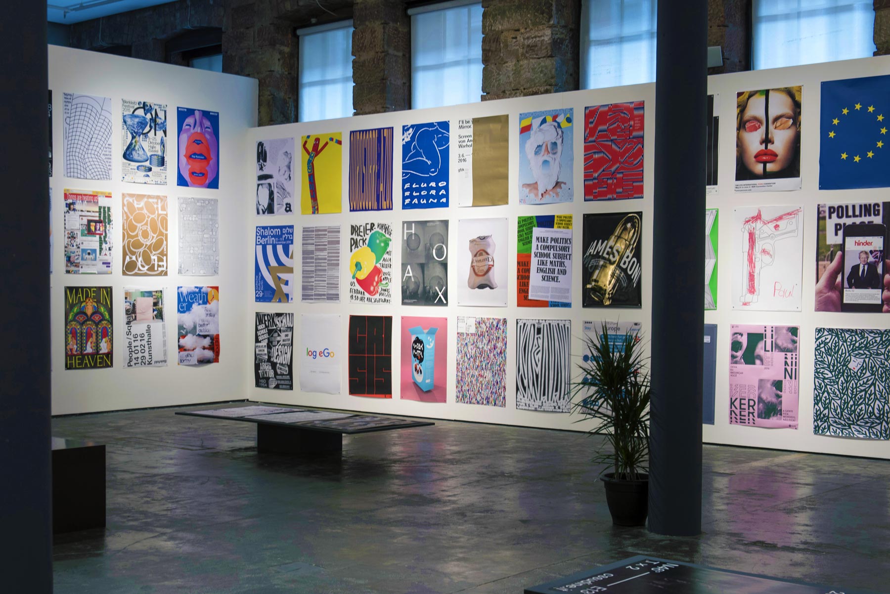
200 of these submissions were selected for exhibition at Graphic Design Festival Scotland 2016 in Scotland’s National Centre for Design and Architecture, The Lighthouse in Glasgow. This exhibition is open from 18th October – 25th November, Monday-Saturday 10am-5pm.
However, there can only be three winners… After some debate and deliberation, we are pleased to announce and congratulate our three winners.
Congratulations to Koos Breen in 1st place with The Royal Academy of Art The Hague x Offprint Paris, Nedelka & Báchor in 2nd place with Measure & Scale and Knoth & Renner in 3rd place with .move ON!
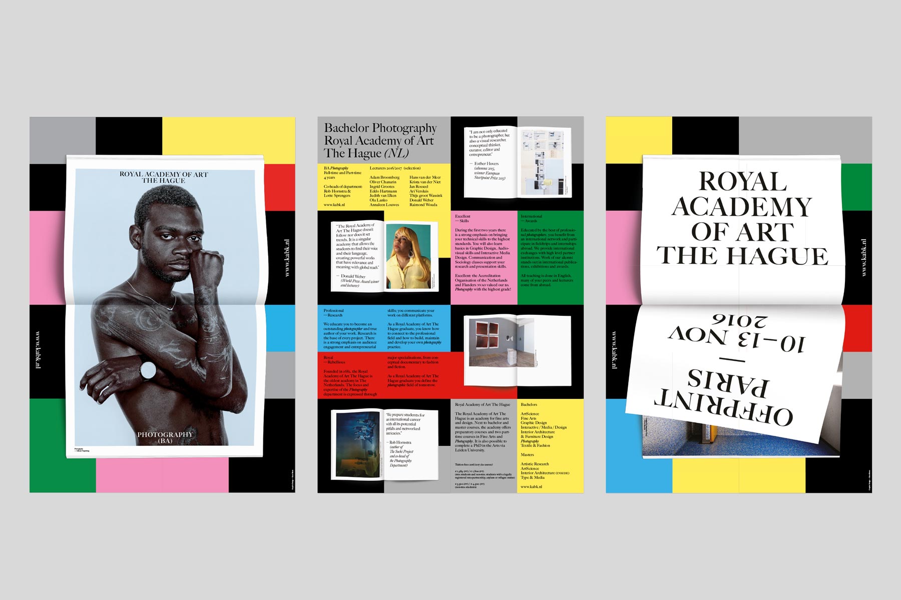
1st Place
Poster title:
The Royal Academy of Art The Hague x Offprint Paris
By:
Koos Breen, The Netherlands
http://koosbreen.com
“The Photography Department of the Royal Academy of Art The Hague presents itself on many book fairs around Europe, with (photo)books by their students and graduates.
They asked me to design a tablecloth to present their books on. And to make a poster for each of the events.
I made a series of posters (5). The posters represent the way the books are presented on the tablecloth. The tablecloth has a coloured blocked grid. And the books are presented open on the cloth. (don’t judge a book by it’s cover).
The posters only show a glimpse of a photo.
The posters are flexible in the way you can hang them, horizontal, vertical or upside down.
And work very well next to each other.
Additionally I made one poster in the same series that doesn’t represent a particular event but the department and academy itself.
The academy is very international (about 60 nationalities) but is still a mainly white school.
So I wanted to represent the academy by a black artist to hopefully change that a bit. The photo is made by Gilleam Trapenberg. Both Gilleam and the model grew up in Curacau (island of the former Netherlands Antilles), and live and study in NL.
The body of the model is a canvas as well, his tattoos are by Trobbies, a tattoo artist and another graduate of the Royal Academy.”
Printing/finish:
Offset on high gloss paper.
Format:
All the posters (a2size) are double sided and are folded (to a4) . The frontside represents the event/academy and the back side shows information about the department and curriculum. The posters belong together as a series, which after some discussion we accepted as one single entry.
Some comments from the jury:
“The background with the pattern and the photographed book give a classic appearance while the graphic, photographic and typographic elements are working well together. The posters have a friendly timeless touch through the colours.” – Lamm & Kirch
“The series is a strong combination of an interesting concept with an original, engaging and practical resolve. It also works particularly well as a functional and practical piece of design which we value highly.” – Warriors Studio
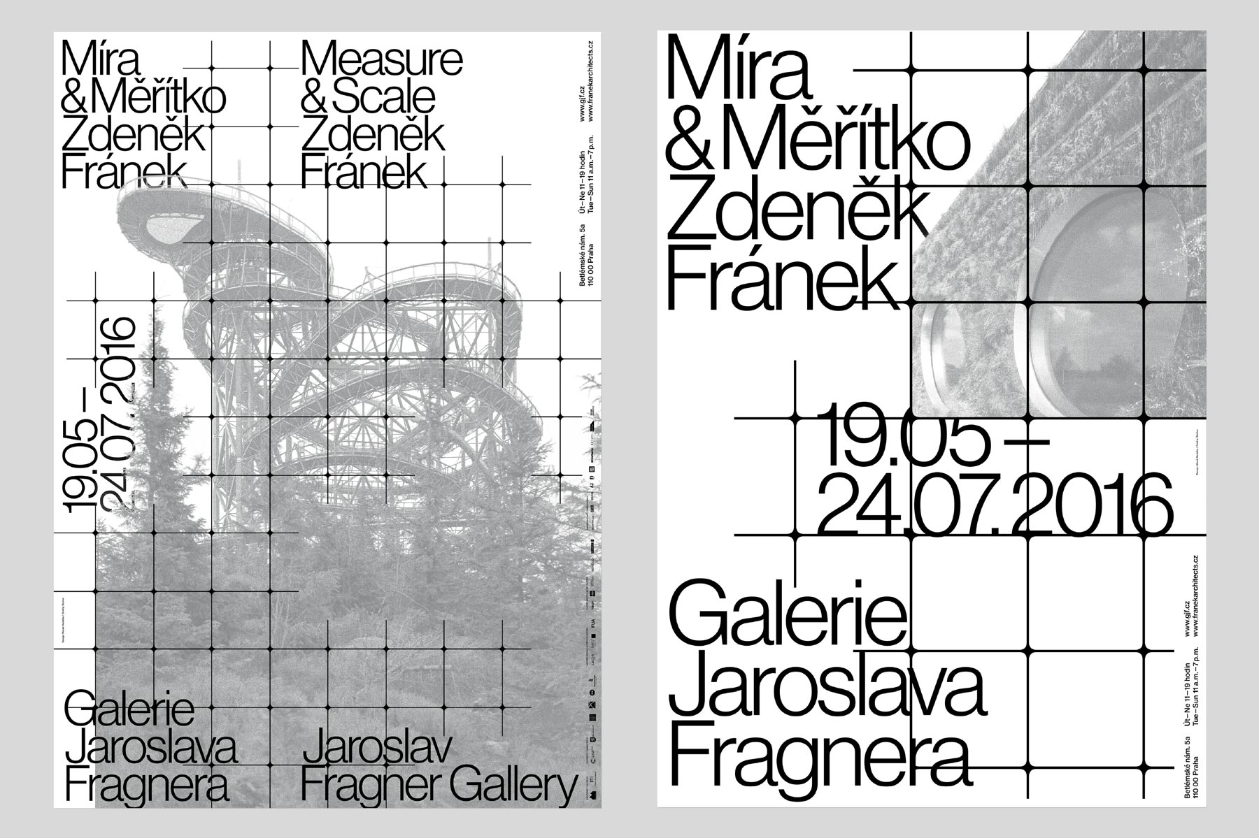
2nd Place
Poster title:
Measure & Scale
By:
Nedelka & Báchor, Czech Republic
mareknedelka.com
“Designed for the solo exhibiton of honored Czech architect Zdeněk Fránek in Jaroslav Fragner Gallery (Prague).
The exhibition presents three of his most important recent projects. The name refers to two parameters that Zdeněk Fránek challenges from time to time. We connected whole design with the specific raster to show different scales of presented projects. We made poster triptych to express this using different scales of type, raster and images.” – Nedelka & Báchor
Printing/finish:
665 x 950 mm, offset print, two spot colors (Pantone Black C, Pantone 877 C), Munken Lynx Rough 120g/m
Comments from the jury:
“ Measure and scale appears really precise in same time than sensitive, both original and contemporary.” – Etienne Hervy
“the grid, type and photographic image are working into each other. it looks like that parts of the grid are processed with a rubber. that gives a cloudy analogue effect, that makes the posters agile. Working well as series.” – Lamm & Kirch
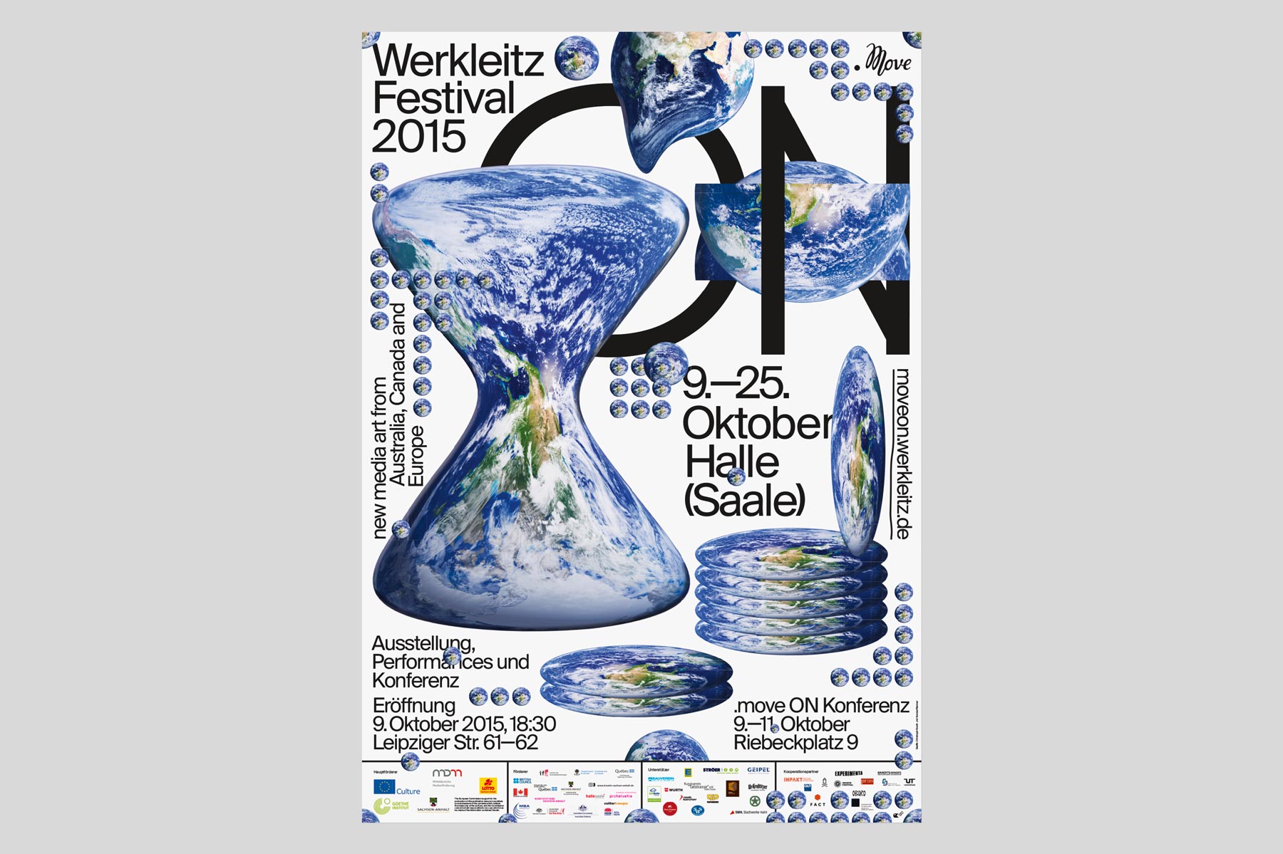
3rd Place
Poster title:
.move ON
By:
Knoth & Renner, Germany
knoth-renner.com
“The poster was designed for Werkleitz — Center for Media Art, Halle, Germany.
With generic views of the globe, the visual identity for the 2015 Werkleitz Festival tries to question about cultural production nowadays. In globalized and digital connected networks of artists, curators and art institutions, one could assume that our world is more and more growing together. The visual elements on the poster are playing with this idea, semantically and humorously.”
Printing/finish:
Offset printed and designed with digital tools.
Comments from the jury:
“.move ON to us is different from the classic well crafted typographic poster. We really like the nonchalant way the graphic elements are treated – Unfun
Share:
09/11/2016
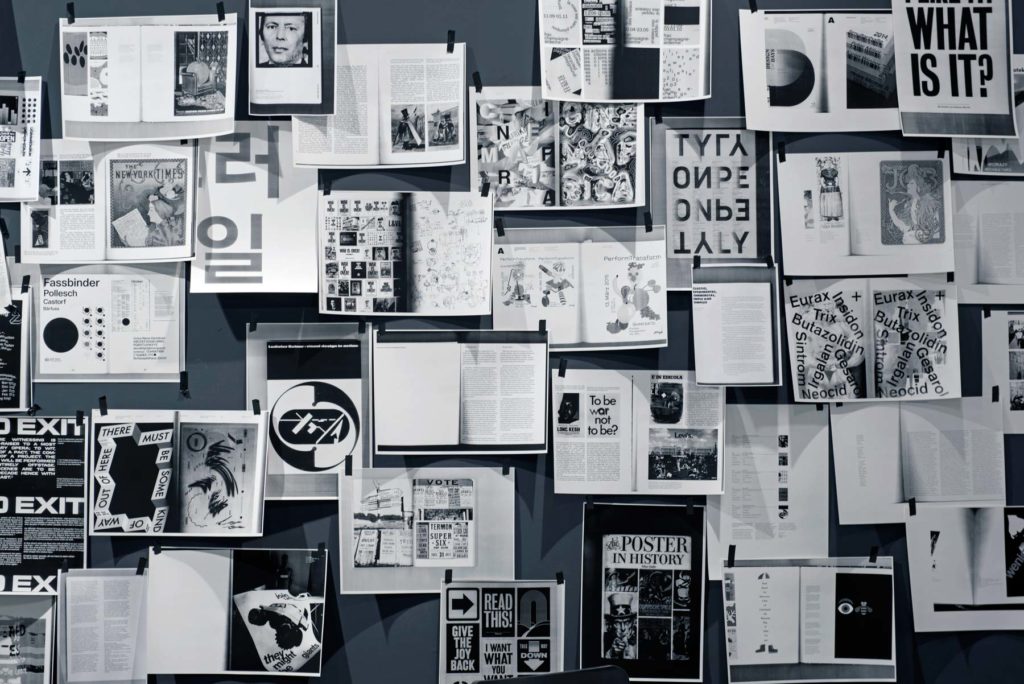
Within our International Poster Exhibition this year we curated a library of books from carefully selected publishers, which provide more details on the broader context of poster and graphic design. In the library area, we encouraged visitors to read, scan and share with a black and white copier and a wall for pinning up and sharing. […]
Read more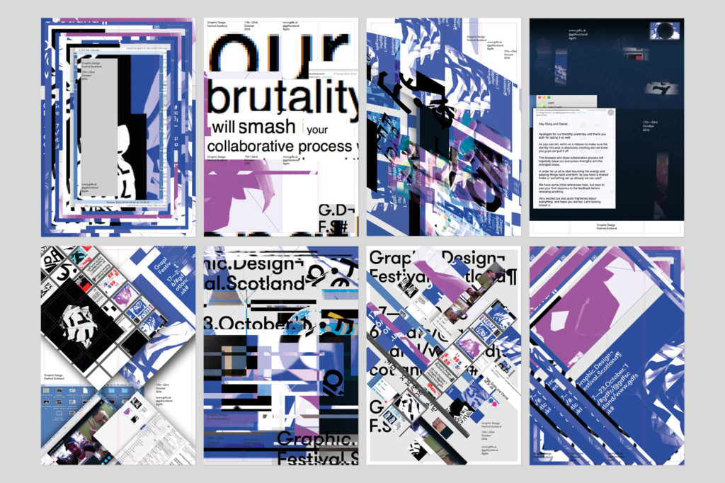
08/10/2016
Our 2016 identity explored process, collaboration and the dialogue which unfolds as ideas are developed and visualised. As an extension of the collaboration between Warriors Studio and Freytag Anderson, who developed this year’s identity, the source files for the poster were made public and designers around the world were invited to download and rework the poster […]
Read more