You are viewing the Graphic Design Festival Scotland 2018 archive. Click Here for the Current Festival.
GDFS 19—25.10.18 5th Birthday!
GDFS

News → Article
International Poster Competition 2017 Winners
26/10/2017
We are delighted to announce the winners of our 2017 International Poster Competition.
 In 3rd place:
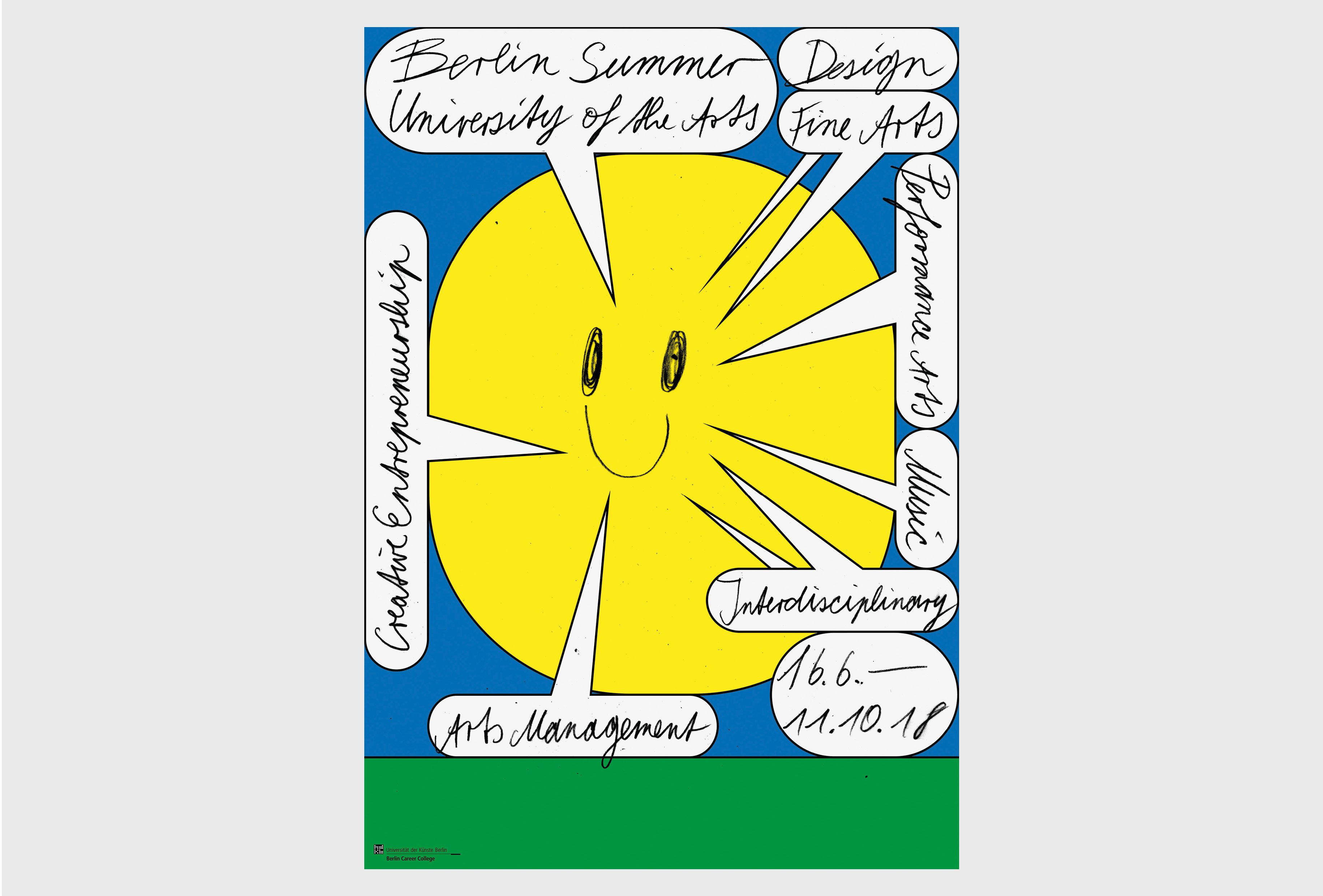
Robert Radziejewski
Berlin Summer University of the Arts
2017 (Germany)
“The sun is the symbol for summer. It directly speaks to the observer and provides all important information on the university’s offered courses. It’s puerile appearance aims to take away the seriousness of the institution to encourage more people to attend the programmes.” Robert Radziejewski
“I felt good about this poster from the first impression. After reading the caption, it immediately became my adored work. I had not imagined that the yellow circle looking like Pac Man would be a sun… It’s interesting to see the speech bubbles work like sunshine rays. There are light touches in the design but moderate seriousness remains, so in the end it’s overall look is very sophisticated. It is comfortable to look at and at the same time it’s clever, cute, charming, sophisticated. Seoul is already in the fall, and this poster reminds me of last summer. Not only the last summer of this year, but also the summers of my childhood. The inspiration of this poster begins in a cutesy manner but ends nostalgically. Reminds me of something I once lost.” Jaemin Lee
“The poster has an appealing bitter-sweet feeling. There is an enjoyable simplicity in being able to trace the train of thought for the idea of the poster; summer, sun, happiness and announcing information, speech bubbles. Visual symbols which perhaps might seem cliché or mundane are being reused and reinvented in a fresh and playful way.” Warriors Studio
“With most entries leaning heavily on computer generated graphics, it was refreshing to come across the simplicity and naivety of this hand-drawn entry during the judging process. There is a time and a place to get deep and meaningful don’t get me wrong, but what I loved most about this poster is its confident and considered no-frills approach. It cuts through the noise and what you see is what you get.” Jamie McIntyre
 In 2nd place:
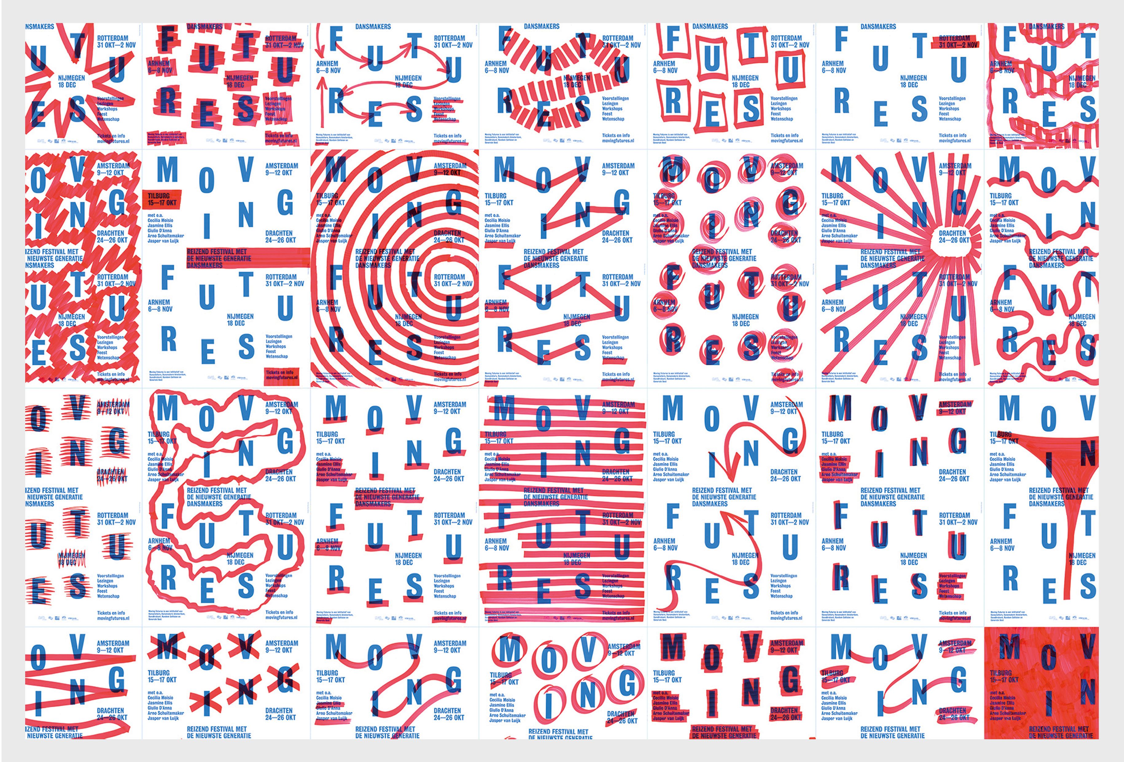
Team Thursday
Moving Futures Festival 2014
2014 (The Netherlands)
Jury’s comments:
There are a number of qualities Moving Futures series has which the judges commended. Firstly, it was one of few posters within the competition which integrated a consideration of financial restraints and conditions into the design process. One poster, printed in one colour was edited by hand to create a series of editions uniquely relevant to multiple events in multiple locations.
“Bold, simple and honest, made with a great attitude. Communicates the content very well. Clearly, a series that is made with a lot of fun. I really like the performative action, involved with dance, which is involved in making the posters. Would love to have seen this performative poster-making-action!” Koos Breen
“The carefully constructed typography, juxtaposed with the hand-made playful marks showcases two arguably opposing or disparate aspects of design. The series is both considered and well constructed but also free and playful. There’s an accessibility and authenticity to the design which is also valuable.” Warriors Studio
It must be addressed that these posters were designed in 2014, as a competition, we accept entries designed within the past 3 years, so it is permitted, although this welcomed debate and discussion amongst the jury. However, given that the merits the poster series is being commended for are equally relevant today, and are still highlighted as being well considered, intelligent and produced to a good standard, this is a testament to the quality of the work.
In 1st place:
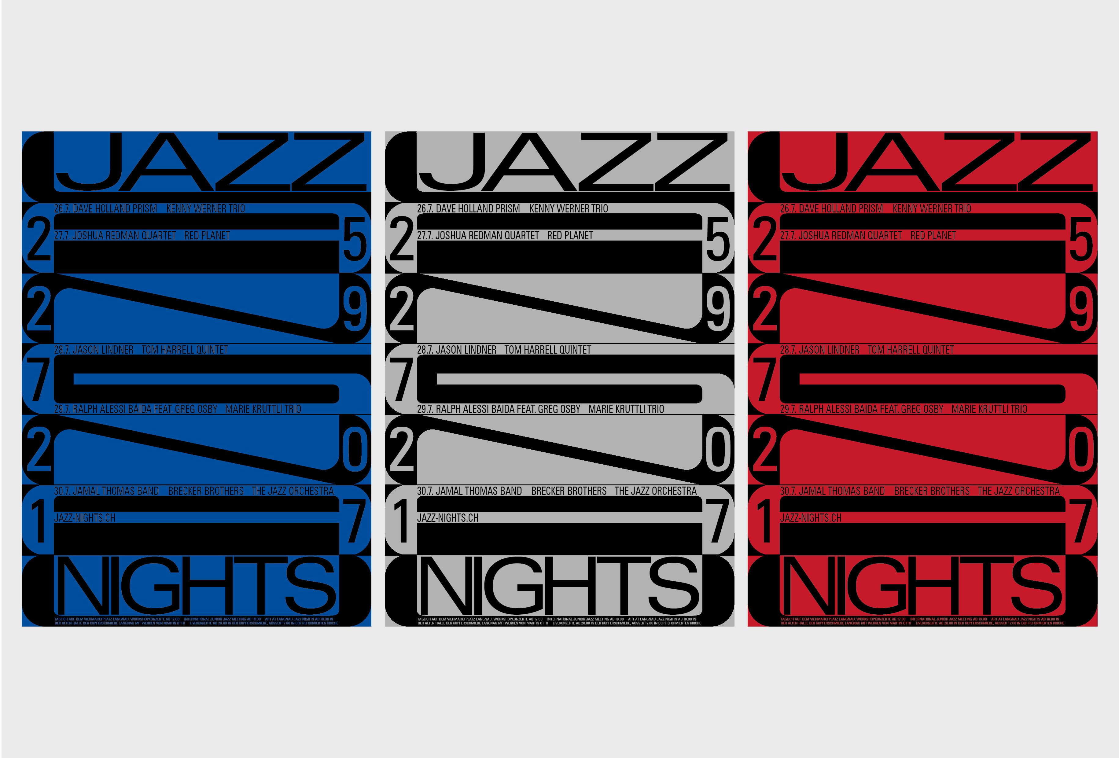
Aurelia Peter
Langnau Jazz Nights
2016 (Switzerland)
Jury’s comments:
“The appealing point of this poster is the harmony of slightly awkward elements. The extremely extended or extremely condensed type, mixed in a somewhat coarse state, and the rounded corners which are not common to see in a jazz poster all work well together. It looks a bit uncomfortable and yet I can not take my eyes off it, which I think is the aesthetic of this poster.
Also, it takes quite a lot of effort to decode information such as dates, but I think that’s a part of its personality. Jazz music resembles that characteristic. Jazz is good because it’s not obvious. This poster doesn’t make me think of modern jazz or post-bop jazz, but more of a fairly contemporary European jazz. It is encouraging to note this because there haven’t been many good visual outputs in that particular genre. The poster also reminds me of a city’s night somehow. This is also a kind of work that makes me look for a long time.” Jaemin Lee
“I think it’s difficult to communicate an atmosphere through a poster, but Langnau Jazz Nights does it beautifully. I can almost feel the vibes inside the club. The poster is interesting from a technical point of view but it also has an emotive quality. It has soul. It also lives as a contradiction. It’s simple yet complex. It’s big and bold, but there are many beautiful details to draw you in. It’s intriguing like there’s more than meets the eye. I find a different aspect exciting, each time I look at it.” Warriors Studio
“It’s a well-crafted and balanced poster. The composition is very well considered and despite the strict composition, the poster doesn’t feel rigid at all. The rhythm of the jazz is well communicated. The ‘pagewide’ typography almost works like an alternative music notation.” Koos Breen
“To the detriment of the genre, communications around jazz are often riddled with clichés and Saul Bass rip off’s. This poster feels more contemporary and progressive in its execution. With its dense use of black and clever use of negative space, it feels like the whole poster is connected in some way, like a fluid cross-section of a brass instrument I just want to play.” Jamie McIntyre
You can read an interview with each of the three winners alongside 7 other designers featured in our 2017 International Poster Exhibition. In the shop here: http://gdfs.uk/shop
Share:
04/12/2017
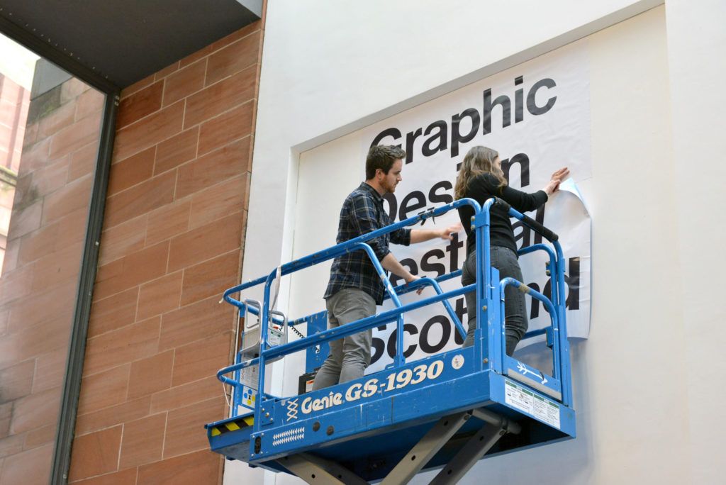
This year Hobs Repro took care of producing and installing the festival signage including pillar wraps for the bollards, a new banner for the outside entrance, a banner at reception to welcome everybody in, stacks of vinyl lettering for the International Poster Exhibition and the printing of a 5 metre tall supergraphic. When we considered installing […]
Read more
20/03/2017
We launched SHORTS at GDFS 16 in collaboration with Pretend Lovers to provide a platform to showcase design-related short films within a wider programme of shorts by artists, designers and film makers from around the world. The films shown were a curated selection of open-call submissions, received between 16.06.16 and 10.09.16. We placed no restrictions around theme or subject and all […]
Read more

